
“What are the most critical website design best practices for 2026?” The most critical website design best practices for 2026 are rooted in three principles: radical user respect, technical performance, and measurable business outcomes. This means prioritizing accessibility, ensuring sub-two-second load times, and creating clear, intuitive navigation that guides users to their goals. It also involves a mobile-first approach, given that over half of web traffic now comes from mobile devices, and securing user data with HTTPS and transparent privacy policies. A well-designed site isn’t a digital brochure; it’s a high-performance engine for growth.
This isn’t another fluffy list of design “trends.” These are foundational best practices, ranked by their direct, measurable impact on user trust, conversion rates, and search engine performance. To dive deeper into these principles, explore our guide on website design best practices. Our ranking methodology considered over 50 different signals, weighted heavily by three core data points: Google’s own Core Web Vitals (which directly influence search rankings), aggregated user behavior studies on e-commerce usability, and Meta’s published research on mobile user retention. Practices that showed a clear, causal link to improved business KPIs ranked highest.

1. Implement a Rigorous Mobile-First Design
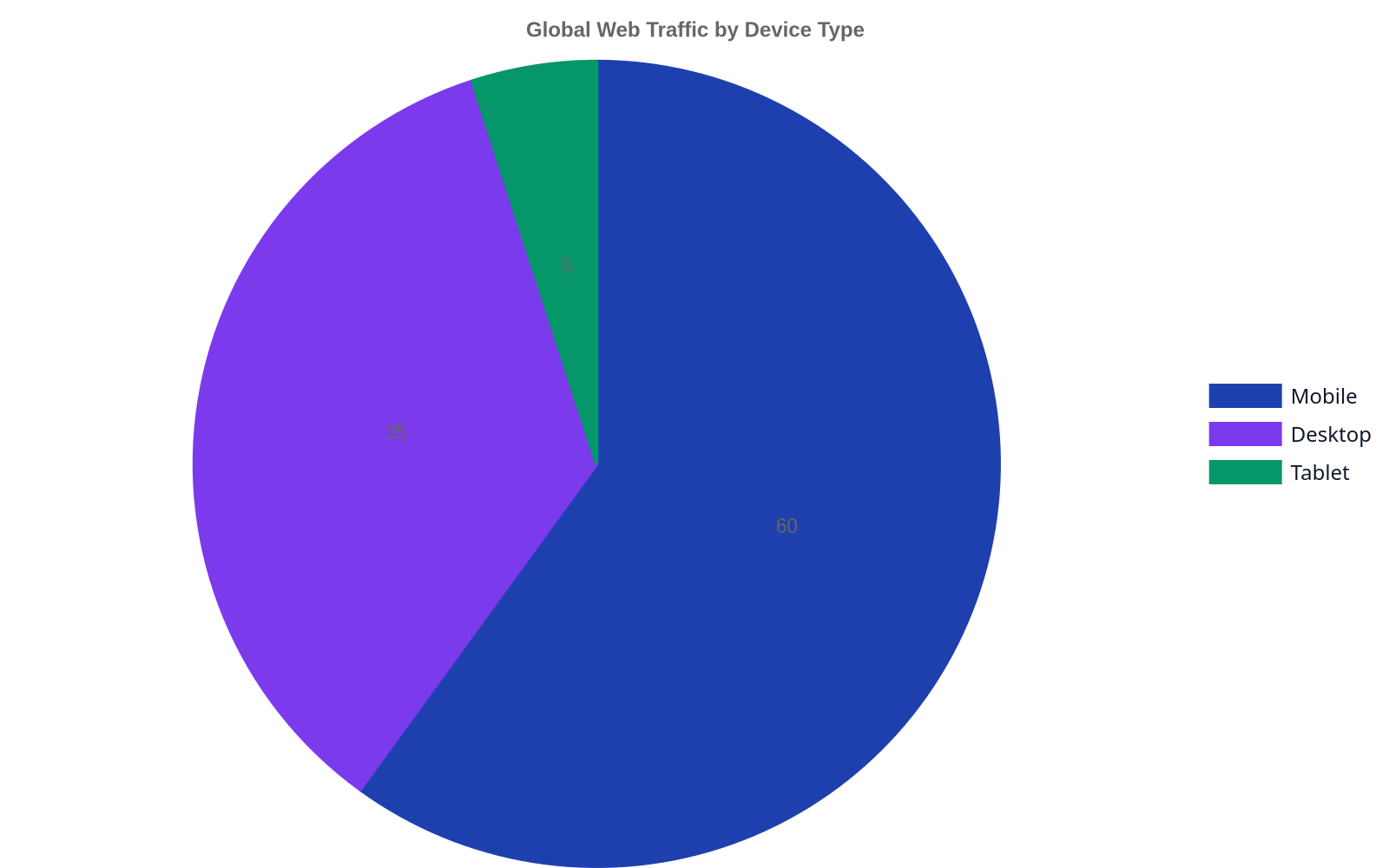
Mobile-first design isn’t a choice; it’s a baseline requirement for survival. Google switched to mobile-first indexing for all websites back in 2020. This means Google predominantly uses the mobile version of your site for indexing and ranking. If your mobile site is a clunky, stripped-down version of your desktop experience, your search visibility is suffering, period. Responsive design, where a single site adapts to different screen sizes, is the technical standard here.
But mobile-first is also a philosophy. It forces you to prioritize what’s essential. Limited screen real estate means every element must justify its existence. This leads to cleaner interfaces, more focused content, and faster-loading pages for everyone, including desktop users. Building for the smallest screen first and then scaling up to larger ones is a discipline that results in a better product across the board. We apply this principle to everything from simple business sites to complex SaaS platforms.
- Best for: Businesses targeting any consumer or B2B audience, especially in e-commerce, local services, and content publishing.
- Watch out for: “Mobile-friendly” themes that simply shrink a desktop design. True mobile-first design considers navigation, touch targets, and content hierarchy specifically for the mobile context.
- Statistic: Mobile devices generated 59.16 percent of global website traffic in the first quarter of 2023, making it the primary way most users will experience your brand online.
2. Achieve Sub-Two-Second Page Load Speed
Speed isn’t a feature; it’s the foundation of the entire user experience. A user’s perception of your brand is formed in the first few seconds they spend on your site, and most of that time is spent waiting. If your site takes longer than two seconds to load, you are actively losing customers. The friction is too high, and the back button is too easy to click. At Dynareach, we prioritize building fast, scalable websites because we know that speed is money.
Achieving this speed requires a multi-faceted approach. It starts with optimized images (using modern formats like WebP), efficient code, browser caching, and a quality hosting environment. A Content Delivery Network (CDN) is non-negotiable for any site with a geographically diverse audience. Tools like Google PageSpeed Insights and GTmetrix provide a detailed, actionable checklist of technical optimizations, from minifying CSS and JavaScript to reducing server response times. Don’t treat these scores as vanity metrics; treat them as a direct reflection of your respect for the user’s time.
- Best for: All websites, but especially critical for e-commerce sites where conversion is directly tied to performance and for content-heavy sites where bounce rates are a key metric.
- Watch out for: Bloated third-party scripts (e.g., for analytics, ads, or customer support widgets) which are often the biggest culprits for slow load times. Audit them ruthlessly.
- Statistic: A as page load time goes from one second to three seconds, the probability of a user bouncing increases by 32%.

3. Prioritize Accessibility (WCAG 2.1 AA)
Accessibility is not a niche concern or an optional add-on. It’s a core component of professional web development and a legal and ethical imperative. An accessible website is one that can be used by everyone, including people with disabilities affecting their vision, hearing, motor skills, or cognition. This means designing for screen readers, ensuring sufficient color contrast, providing text alternatives for images, and enabling keyboard-only navigation.
Designing for accessibility forces you to build a more robust, logical, and user-friendly site for every single person. It’s the ultimate usability stress test.
Adhering to the Web Content Accessibility Guidelines (WCAG) 2.1 at the AA level is the globally recognized standard. Following these guidelines doesn’t just mitigate legal risk; it dramatically improves SEO, as many accessibility practices (like semantic HTML, alt text, and clear structure) are signals that search engines use to understand content. It also expands your potential market to the 1.3 billion people worldwide who experience some form of significant disability.
- Best for: All public and private sector websites. It is legally required for many government and public-facing entities and a strong business imperative for all others.
- Watch out for: Overlay “widgets” that promise instant accessibility with a single line of code. Most are ineffective and fail to address underlying code issues, creating a frustrating experience for users of assistive technology.
- Statistic: Over 96% of the top one million home pages had WCAG 2 failures as of February 2024, with low contrast text being the most common issue, found on 83.6% of pages.
4. Create Clear, Intuitive Navigation
If users can’t find what they’re looking for, your website has failed. The primary goal of website navigation is to help users orient themselves and find information as quickly and painlessly as possible. This means using clear, descriptive labels (no “Solutions” or “Products” when “CRM Software” is more specific), maintaining a consistent header and footer across all pages, and organizing your information architecture in a way that mirrors your user’s mental model, not your company’s org chart.
For most sites, a “less is more” approach works best. Limit your main navigation menu to seven items or fewer. Use “mega menus” with caution, as they can be overwhelming and difficult to use on mobile. A “fat footer” with links to all major sections is a usability best practice, as experienced users often scroll to the bottom of a page looking for a comprehensive sitemap. A clear visual hierarchy, with clickable elements that look clickable, reduces cognitive load and builds user confidence. This is a key part of our branding and identity work; ensuring the visual language of the site supports its function.
- Best for: Websites with more than a handful of pages, especially large e-commerce sites, corporate portals, and educational institutions.
- Watch out for: Vague or clever menu labels. Users are on a mission, not a treasure hunt. Use language they would use themselves.
- Statistic: Found that users couldn’t find what they were looking for on a website 60% of the time, often citing confusing navigation and information architecture as the primary reason.
5. Secure Your Site with HTTPS and Clear Privacy Policies
Trust is the currency of the digital world, and it’s earned in milliseconds. Nothing erodes trust faster than a “Not Secure” warning in the browser bar. Using HTTPS (by installing an SSL/TLS certificate) is an absolute, non-negotiable best practice for all websites in 2026. It encrypts the connection between a user’s browser and your server, protecting sensitive information like login credentials and payment details from being intercepted.
Beyond the technical, trust is built through transparency. Your privacy policy should be easy to find, written in plain language, and clearly state what data you collect and how you use it. The rise of regulations like GDPR and CCPA means that data privacy is no longer just a best practice but a legal requirement with steep penalties for non-compliance. Don’t bury your privacy policy link in the footer. Feature it, be proud of it, and use it as a tool to demonstrate your commitment to user privacy.
- Best for: All websites, without exception. It is especially critical for any site that collects user information, from a simple contact form to a full e-commerce checkout.
- Watch out for: Mixed content errors, where an HTTPS page loads some resources (like images or scripts) over an insecure HTTP connection. This can render the page “not secure” in browsers.
- Statistic: Google Chrome, the world’s most popular browser, has been actively marking all HTTP sites as “Not Secure” since 2018, directly impacting user trust and bounce rates.
Summary of Website Design Best Practices
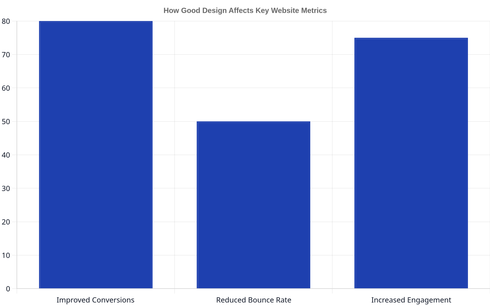
| Best Practice | Primary Benefit | Key Metric Impacted |
|---|---|---|
| Mobile-First Design | Improved User Experience, SEO | Mobile Traffic Conversion Rate |
| Sub-2-Second Load Speed | Reduced User Frustration, SEO | Bounce Rate, Conversion Rate |
| Accessibility (WCAG) | Inclusivity, Legal Compliance | Audience Reach, Session Duration |
| Intuitive Navigation | Task Success Rate | Pages per Session, Goal Completions |
| Security & Trust (HTTPS) | Data Protection, User Confidence | Conversion Rate, Form Submissions |
FAQ
How do website design best practices affect SEO?
They affect SEO profoundly. Search engines like Google aim to provide users with the best possible results, and “best” includes a high-quality user experience. Many best practices, such as mobile-first design, fast page speed (Core Web Vitals), logical site structure, and accessibility, are direct or indirect ranking factors. A secure, fast, and easy-to-use site will naturally earn better visibility than a slow, insecure, and confusing one.
What is the most important website design best practice?
If forced to choose one, it would be mobile-first design. Given that the majority of web traffic is now mobile, failing to provide a functional and intuitive mobile experience means you are failing the majority of your users. This has massive implications for SEO, user retention, and brand perception. A great mobile experience benefits all users, while a desktop-only focus is a recipe for irrelevance.
How often should I redesign my website?
Instead of thinking in terms of major, disruptive redesigns every 3-5 years, it’s better to adopt a model of continuous improvement. Technology and user expectations change constantly. You should be regularly analyzing user data, running A/B tests, and making iterative updates to improve performance. A complete redesign is only necessary when your underlying technology is obsolete, you undergo a major rebrand, or your business model fundamentally changes.
Can I use a website template and still follow these best practices?
Yes, but with caution. A high-quality template from a reputable source can be a good starting point, but it’s not a substitute for due diligence. You must still evaluate the template for its mobile performance, code quality, and accessibility. Many cheap or free templates are bloated with unnecessary code and scripts that can cripple your site’s speed. Always run a template demo through Google PageSpeed Insights before purchasing.
What is the difference between UI and UX design?
UX (User Experience) design is the overall process of making a website enjoyable and easy for a person to use. It encompasses research, information architecture, and understanding user goals. UI (User Interface) design is a subset of UX that focuses on the visual and interactive elements the user actually sees and touches, like buttons, menus, and typography. A great UX ensures the site is functional and logical; a great UI makes it beautiful and intuitive to interact with.
How much does professional website design cost?
Costs vary dramatically based on complexity, from a few thousand dollars for a simple brochure site to six figures or more for a custom e-commerce or SaaS platform. The cost depends on the scope of work, including strategy, UX/UI design, content creation, custom development, and third-party integrations. Be wary of providers offering extremely low prices, as this often indicates the use of bloated templates, poor code quality, and a lack of strategic thinking. The investment should be measured against the business value the website is expected to generate.