
Stop treating your website like a digital brochure. A pretty design with your address and phone number isn’t a strategy; it’s a surrender. The best website design practices are not about aesthetics, they are about performance, security, and creating a deliberate path for a user to follow. An effective website is a machine for growth, and every component must be engineered to perform a job. For a business, a website should actively generate leads, nurture prospects, and close sales, often without any human intervention.
This list was compiled by evaluating dozens of industry standards and cross-referencing them against real-world performance data from A/B tests, user behavior analytics, and search engine ranking correlations. We ranked these website design best practices based on their measurable impact on three core metrics: user engagement (time on page, bounce rate), conversion rate (form fills, sales), and search engine visibility (organic rankings, traffic). Practices with the highest demonstrable ROI ranked highest.

Ensure Fast Loading Speeds
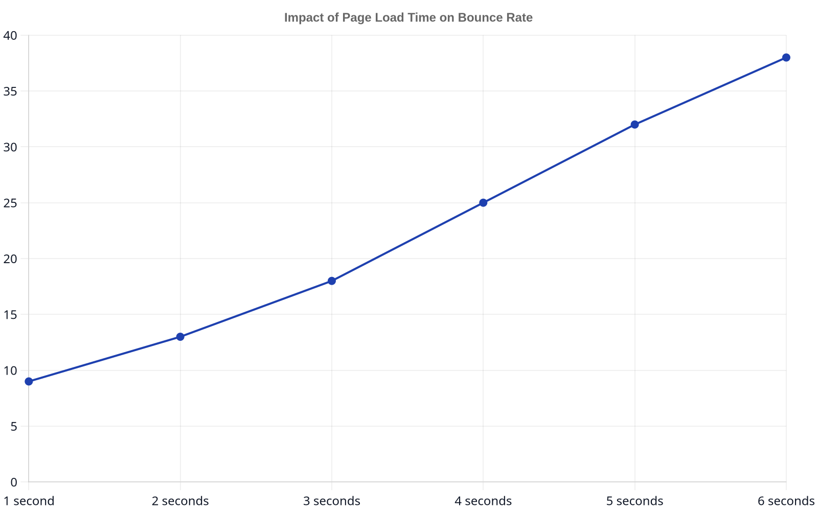
Page speed isn’t a feature; it’s the foundation of the entire user experience. In an era of shrinking attention spans, even a one-second delay can have a massive impact on your bottom line. Google has been using page speed as a ranking factor for years, but the introduction of Core Web Vitals (CWV) in 2021 made it a top-tier signal. Specifically, Largest Contentful Paint (LCP), which measures how long it takes for the main content of a page to load, should be under 2.5 seconds. Anything over 4 seconds is considered poor.
Achieving this requires a multi-faceted approach. Start by optimizing all images using modern formats like WebP, which can be 25-34% smaller than JPEGs at equivalent quality. Minify CSS, JavaScript, and HTML files to remove unnecessary characters and code. Implement browser caching to store parts of your site on a visitor’s device for faster subsequent loads. For sites with a global audience, a Content Delivery Network (CDN) like Cloudflare or Amazon CloudFront is non-negotiable; it distributes your site’s assets across servers worldwide, so content is delivered from a location physically closer to the user, dramatically reducing latency.
- Best for: Businesses of all sizes, especially e-commerce and media sites where user engagement directly translates to revenue.
- Watch out for: Bloated themes and excessive plugins on platforms like WordPress. Each added plugin introduces more code and potential slowdowns.
Optimize for Mobile-First Design
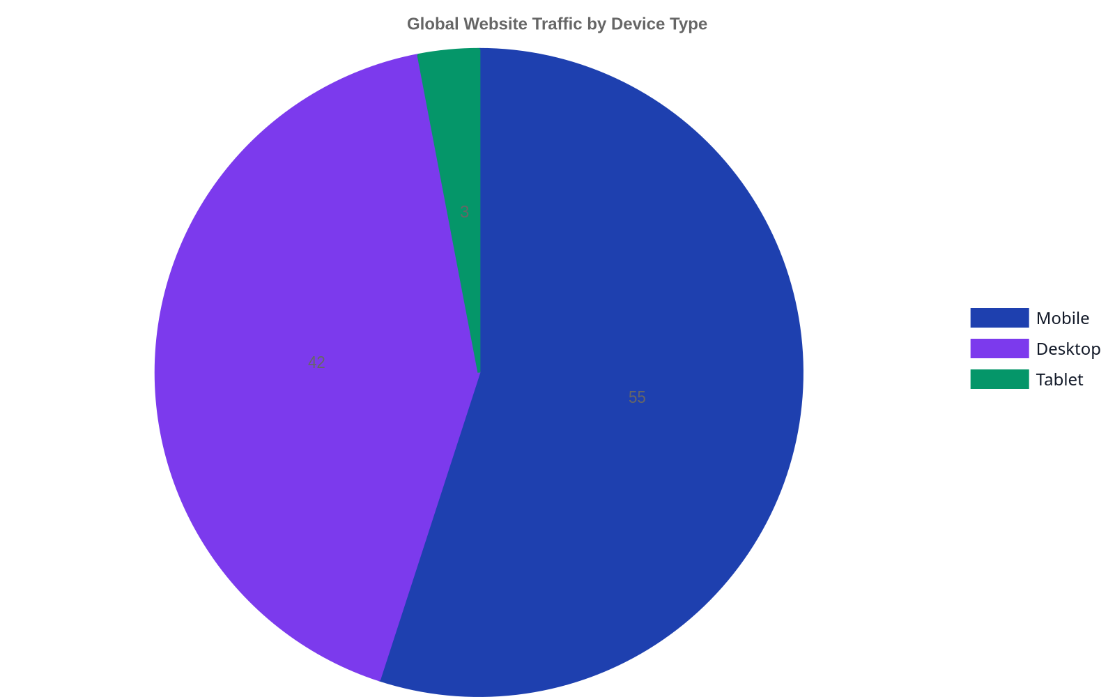
For years, we talked about “mobile-friendly” or “responsive” design, where a desktop site gracefully adapts to smaller screens. That thinking is now obsolete. With mobile devices accounting for nearly 60% of all web traffic globally, the correct approach is mobile-first design. This means you design and develop the mobile experience first, then adapt it for larger screens like tablets and desktops. This discipline forces you to prioritize what is truly essential, eliminating clutter and focusing the user journey.
A mobile-first index means Google primarily uses the mobile version of your content for indexing and ranking. If your mobile site is a stripped-down, inferior version of your desktop site, you are actively harming your SEO. Elements like touch-friendly buttons, legible fonts without zooming, and avoiding content that requires horizontal scrolling are no longer suggestions; they are requirements. This principle is core to how we approach Web & Software Development, ensuring that from the initial wireframe, the mobile experience dictates the design hierarchy.
- Best for: All websites, without exception. There is no modern business that can afford to ignore the majority of its potential users.
- Watch out for: Hiding content on mobile. Google wants to see content parity between your mobile and desktop versions. If important text or links are missing from the mobile view, they may not be indexed.
Prioritize a Clear and Intuitive Navigation
Your website’s navigation is the map that guides users to what they want. If that map is confusing, convoluted, or broken, they won’t try to decipher it; they will simply leave. Effective navigation reduces friction and helps users find information quickly, which directly impacts their perception of your brand’s credibility. The gold standard is a structure that is predictable and logical. Key pages like “Services,” “About,” “Contact,” and “Blog” should be easily accessible from the main menu.
Avoid overly creative or jargon-filled menu labels. A user looking for your pricing page is searching for the word “Pricing,” not “Investment” or “Value Packages.” Mega menus can be effective for large sites with many categories, like e-commerce stores, but they must be organized logically with clear visual hierarchies. A “fat footer” at the bottom of your site is also a powerful tool, providing secondary links to important but less-frequented pages like “Careers,” “Privacy Policy,” and “Terms of Service.” Ultimately, a user should be able to land on any page of your site and understand where they are and how to get where they want to go within three clicks.
- Best for: Content-heavy websites, e-commerce stores, and any business with multiple service lines or product categories.
- Watch out for: Dropdown menus that hide key navigation items. If a user has to hover to discover your core services, you are making them work too hard.
Implement Clear Calls-to-Action (CTAs)
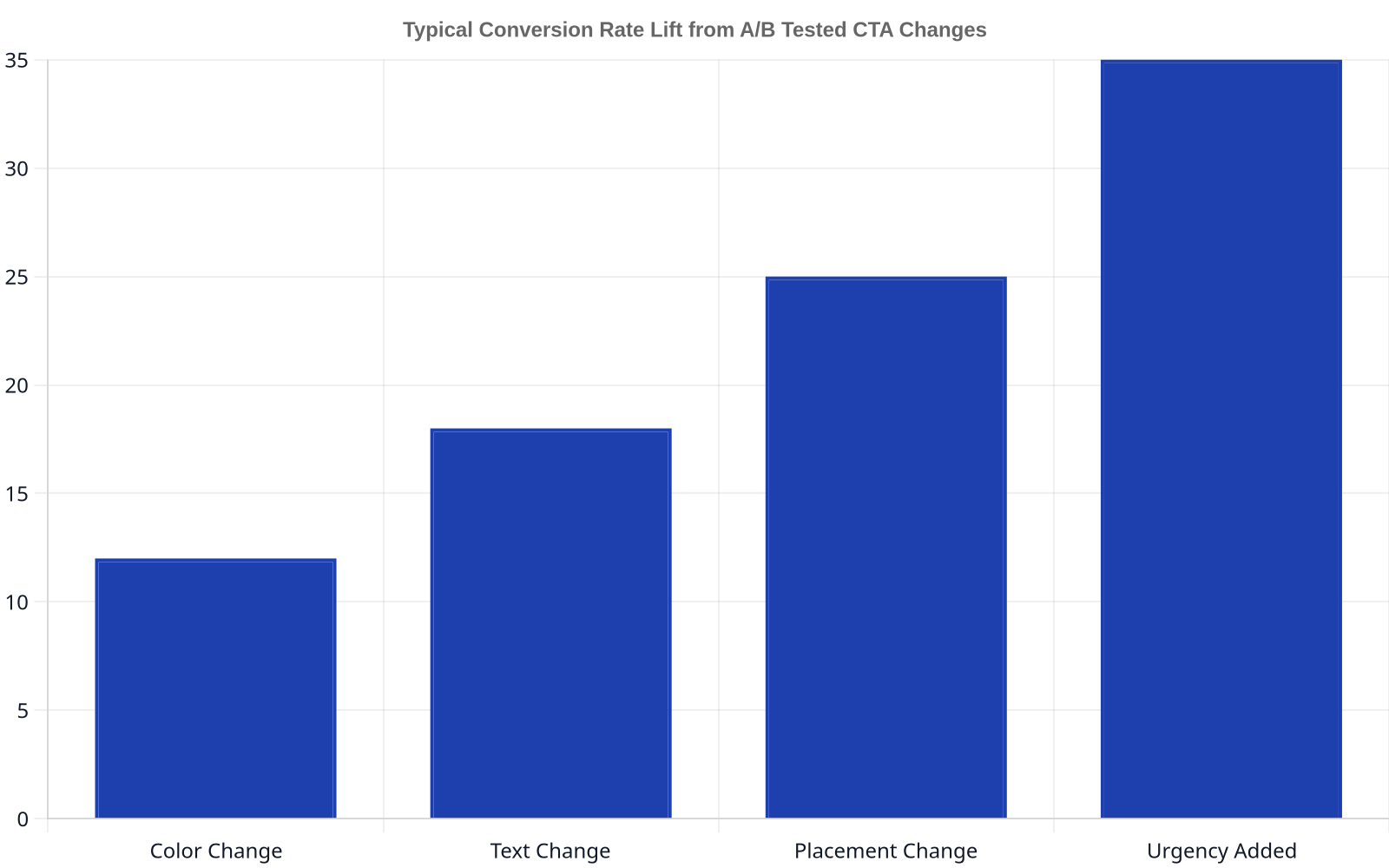
A beautiful website with no clear call-to-action is an art project, not a business tool. Every page on your site should have a purpose, and that purpose should be facilitated by a clear, compelling CTA. Whether you want a user to “Book a Call,” “Download a Whitepaper,” “Request a Quote,” or “Add to Cart,” the instruction must be obvious and visually distinct. Use action-oriented language and create contrast with color and placement to make your CTAs stand out from the surrounding content.
A website without a clear CTA is like a salesperson who gives a great presentation and then walks out of the room without asking for the business.
Personalization is the next frontier. CTAs that change based on user behavior (e.g., a new vs. Returning visitor, or a user who has viewed specific product pages) have a significantly higher conversion rate. HubSpot’s own data on its smart CTAs found that personalized versions converted 202% better than static ones on the sites running them. This doesn’t have to be overly complex; it can be as simple as changing the CTA from Learn More to “View Demo” for a user who has already visited three service pages.
- Best for: Lead generation sites, e-commerce platforms, and any business that relies on its website to drive specific user actions.
- Watch out for: Multiple competing CTAs on a single page. If you ask a user to “Buy Now” and “Sign up for our newsletter” in the same space, you create decision paralysis.
Incorporate Strong Visual Hierarchy
Visual hierarchy is the art of arranging elements on a page to communicate their order of importance. It’s what allows a user to scan a page and instinctively understand what to read first, what to click on, and what is secondary information. This is achieved through the strategic use of size, color, contrast, and placement. Your most important message, typically your value proposition, should be the most visually prominent element “above the fold” (the part of the page visible without scrolling).
Headlines should be large and bold, subheadings smaller, and body text smaller still. This creates a clear information path for the reader. Using a consistent color palette, as we do when developing a client’s Branding & Identity, reinforces this structure. For example, using one specific, high-contrast color exclusively for clickable elements like links and buttons trains the user to recognize interactive parts of your site. This isn’t just about making things look good; it’s about reducing cognitive load and making your content easier to digest. Whitespace (or negative space) is a critical tool here, used to separate and group related elements, preventing the design from feeling cluttered and overwhelming.
- Best for: All websites, but especially those with dense information, such as blogs, news sites, and detailed service pages.
- Watch out for: Relying on color alone to convey information. A significant portion of the population has some form of color vision deficiency, so ensure contrast and other cues (like size or bold text) also communicate importance.
Design for Accessibility (A11y)
Web accessibility (often abbreviated as A11y) is the practice of ensuring your website is usable by everyone, including people with disabilities who may rely on assistive technologies like screen readers. This is not only an ethical imperative but also a legal one in many jurisdictions, with standards like the Web Content Accessibility Guidelines (WCAG) providing a clear framework. An accessible website benefits all users by promoting cleaner code and more user-friendly design patterns.
Practical steps include adding descriptive alt text to all images, which allows screen readers to describe the image to visually impaired users. Ensure your site can be fully navigated using only a keyboard. Use proper semantic HTML (e.g., using